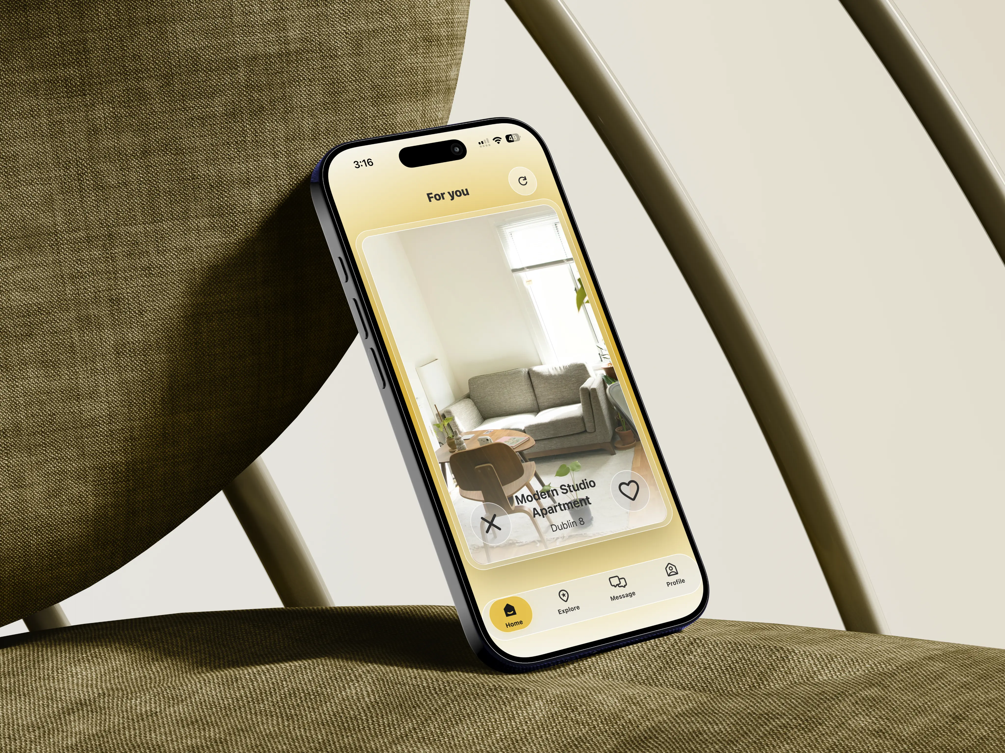
KNOK KNOK — Mobile App
Overview
Knok Knok is a mobile app that helps people find compatible housemates in Dublin's competitive rental market.
Instead of matching people by budget and location alone, it uses structured profiles and lifestyle preferences to connect tenants, roommates, and landlords who are actually a good fit.



Problem Statement



Housing crisis increased shared accommodation in Ireland.
Existing platforms focus mainly on price and availability.
Compatibility between housemates is often overlooked.
Leading to conflicts over shared accommodations.
Research
To understand the real pain points of shared living, I ran a survey with 175 respondents, mostly international students and young professionals in Dublin, plus interviews and user testing sessions.
Had considered moving out because of housemate conflicts
Said lifestyle compatibility matters when choosing housemates
Found compatibility-based matching very or extremely useful
Wanted messaging to unlock only after a mutual match
User Persona

“Sharing a kitchen with 7 people is quite a challenge… keeping the house clean always feels impossible.”
Sofia, 22, international student in Dublin.
She wants to live with people who share her standards for cleanliness, noise and routine. Her frustrations are conflicts over cleaning and guests, and listings that say nothing about who already lives there.
Design Goals
To reduce the stress associated with finding accommodation
User-friendly and welcoming interface
Focus on clarity & compatibility
Navigation and interactions should be smooth and intuitive
Visual Identity
- Friendly
- Modern
- Minimalist
- Transparent
Logotype
Logos + Symbols


Typography
Inter
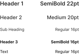
- Sans-serif font
- High readability across digital interfaces
- Adaptability across multiple screen sizes.
Color Palette
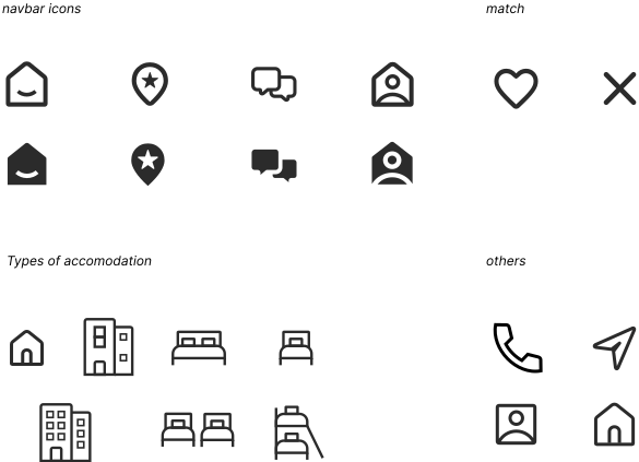
Icons
Made for this project
Graphics
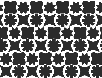
Elements and Pattern


Illustrations
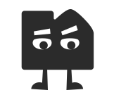
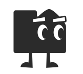
Mascot: Knok







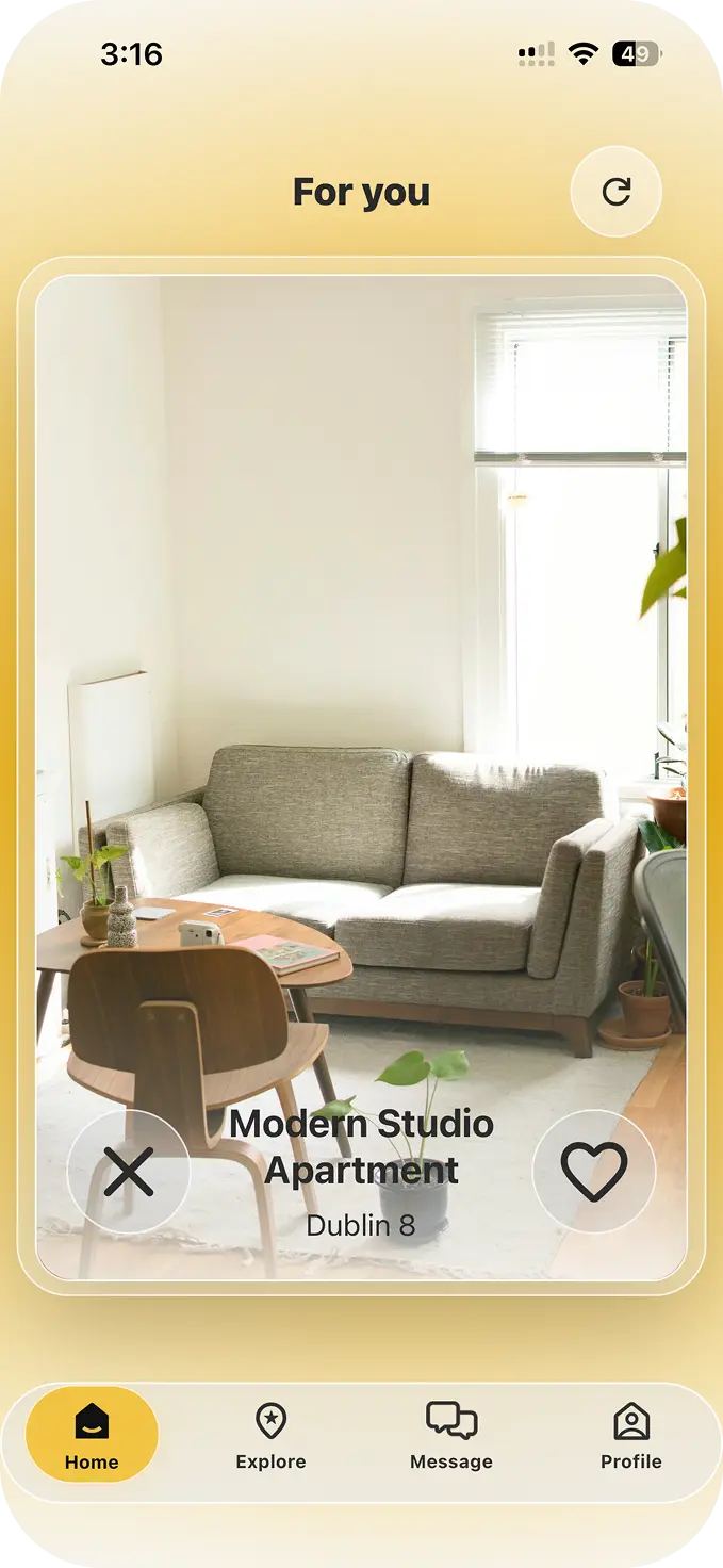
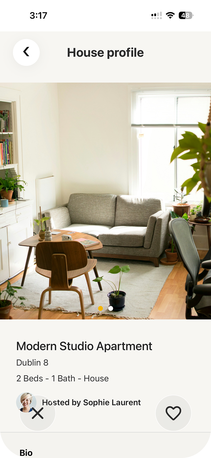
Main Pages
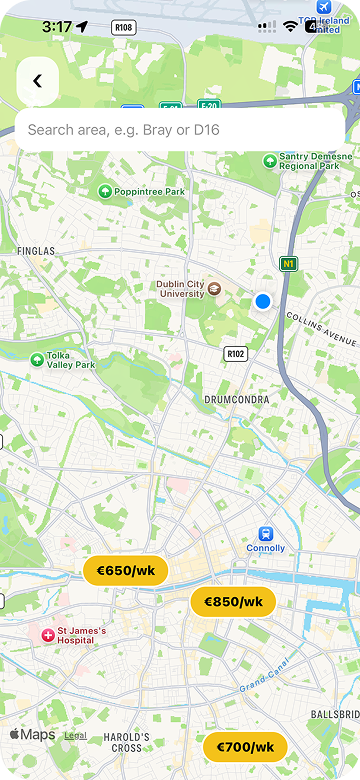 Map
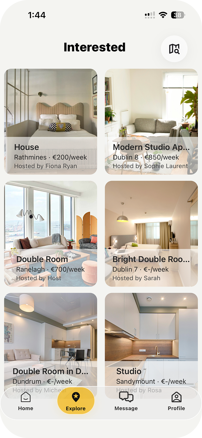
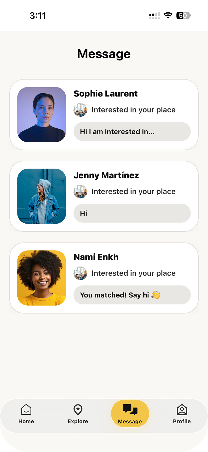
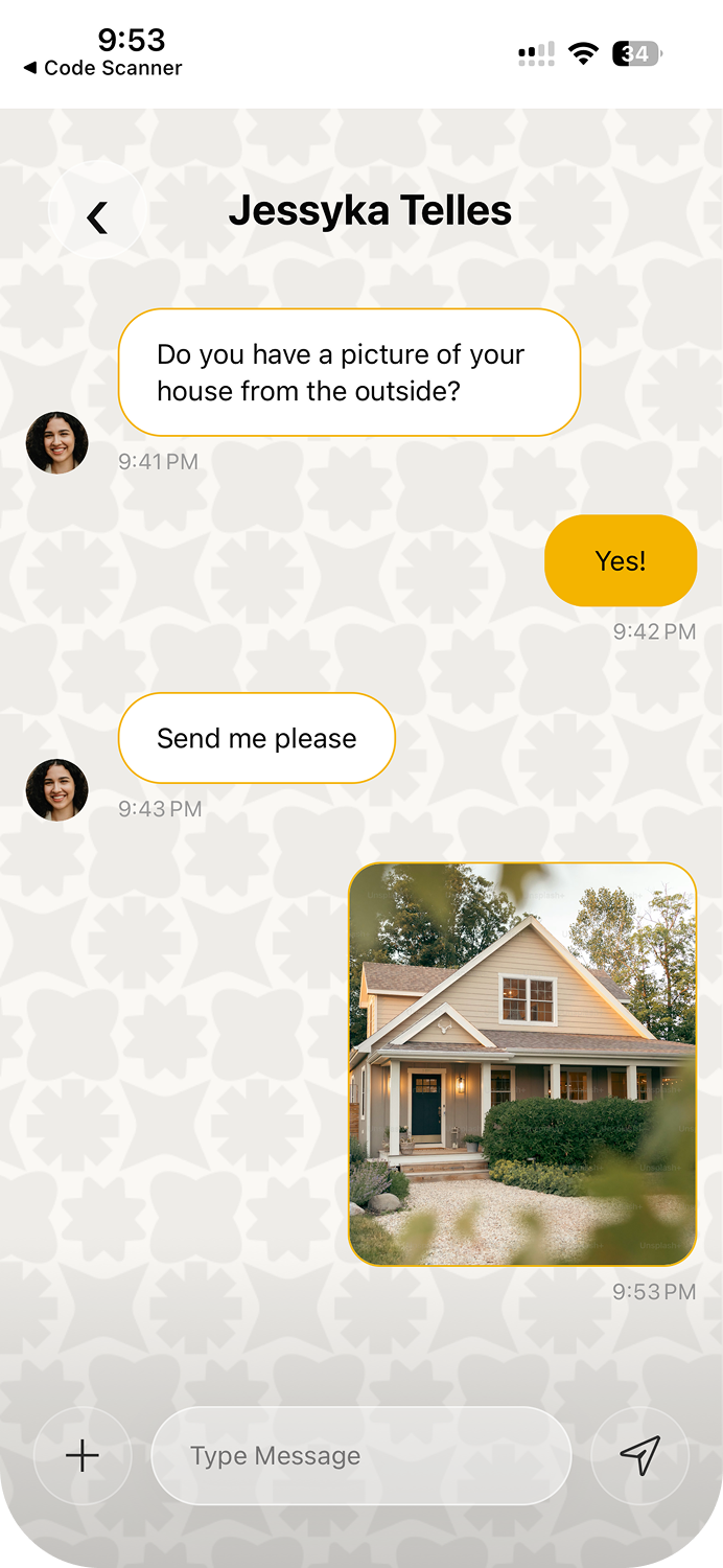
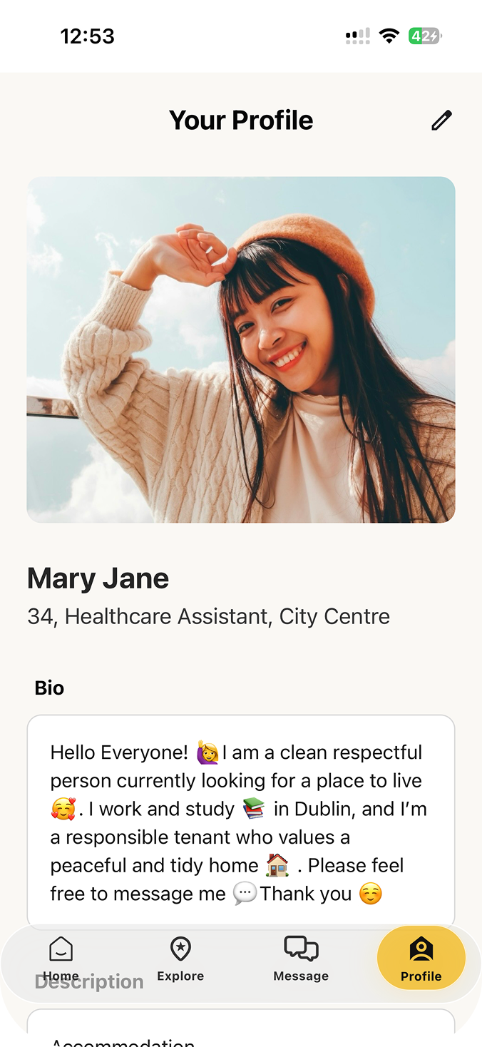
High Fidelity Wireframes
Browse the final designs in Figma.Scroll and zoom to explore each screen.
Outcome & Reflection
Knok Knok came together as a fully working prototype (built in React Native with a real Firebase backend) and tested on real devices across its core flows: onboarding, matching and messaging. Testing surfaced real interaction issues, from duplicate conversations to match notifications firing too early, and we fixed them over several rounds of iteration.
Working in a two-person team showed me how closely design and technical constraints are connected. Every UX decision had to be checked against what could actually be built.
What I'd do next
- Stronger profile verification and safety features
- Smarter matching logic and personalisation
- Accessibility improvements