
Flex Academy: Landing Page
A landing page for a new short-term rental education programme
Overview
Flex Academy is a 12-week group mentorship programme that teaches people to build and scale their own short-term rental company, using the playbook and software behind The Flex and Base360.
The brief
Design the page that introduces it, with one primary goal, getting visitors to book a free strategy call.
Problem Statement
Operators with 5 to 30 units stall: manual pricing, manual ops, no playbook for the next stage.
They already compare options like YouTube, cheap courses and expensive masterminds.
They are sceptical of “guru” marketing.
The page has to earn trust in 30 seconds and still make the next step obvious.
Audience
I chose the operator with 5 to 30 units as the primary audience. They feel the sharpest pain and have the clearest motivation to invest in a structured programme. They also overlap with Base360’s own users, which shaped the visual direction.

Design Goals
A visitor understands who it’s for and what they get within 5 seconds.
Build trust before asking for the call.
One obvious next step at every scroll depth.
Feel like a sibling of The Flex and Base360, with its own personality.
Key decisions
Visual direction
I noticed that Flex and Base360 share almost no visual DNA, which made the brief’s requirement, that they be “sisters”, a significant challenge.
Visually, I leaned closer to Base360 than to Flex, as the target audience for this program is more similar to a Base360 user than to a Flex client.
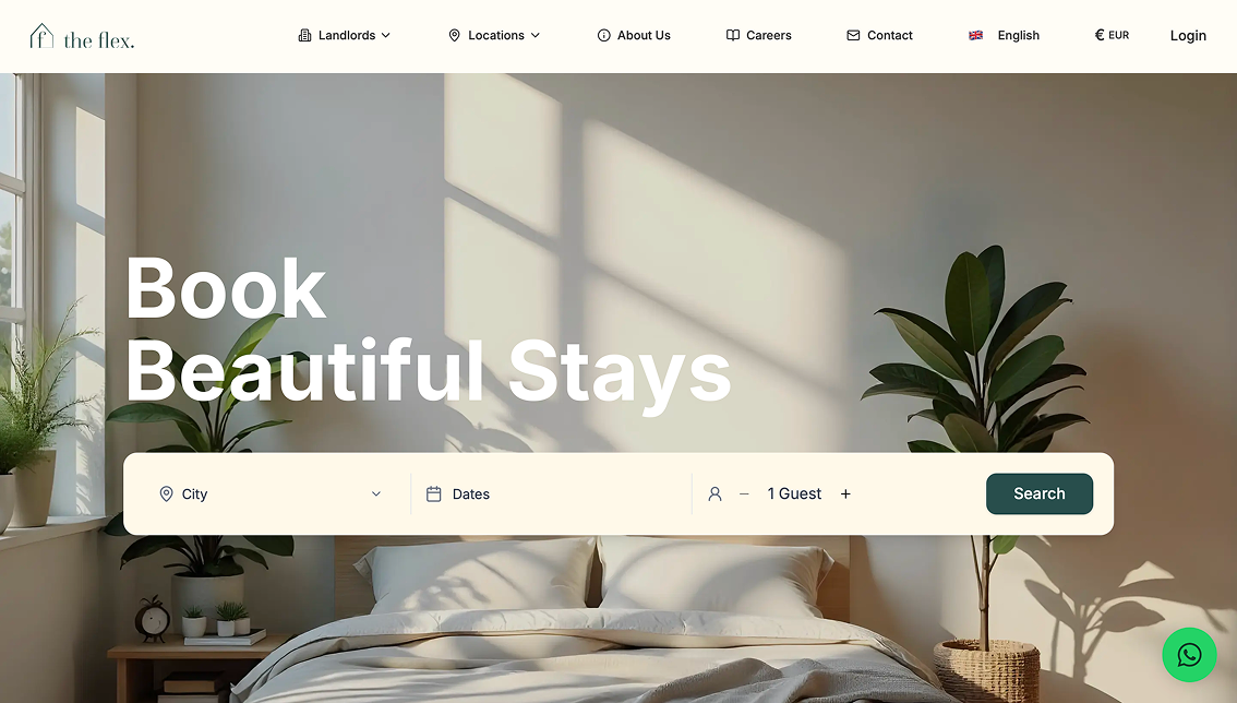
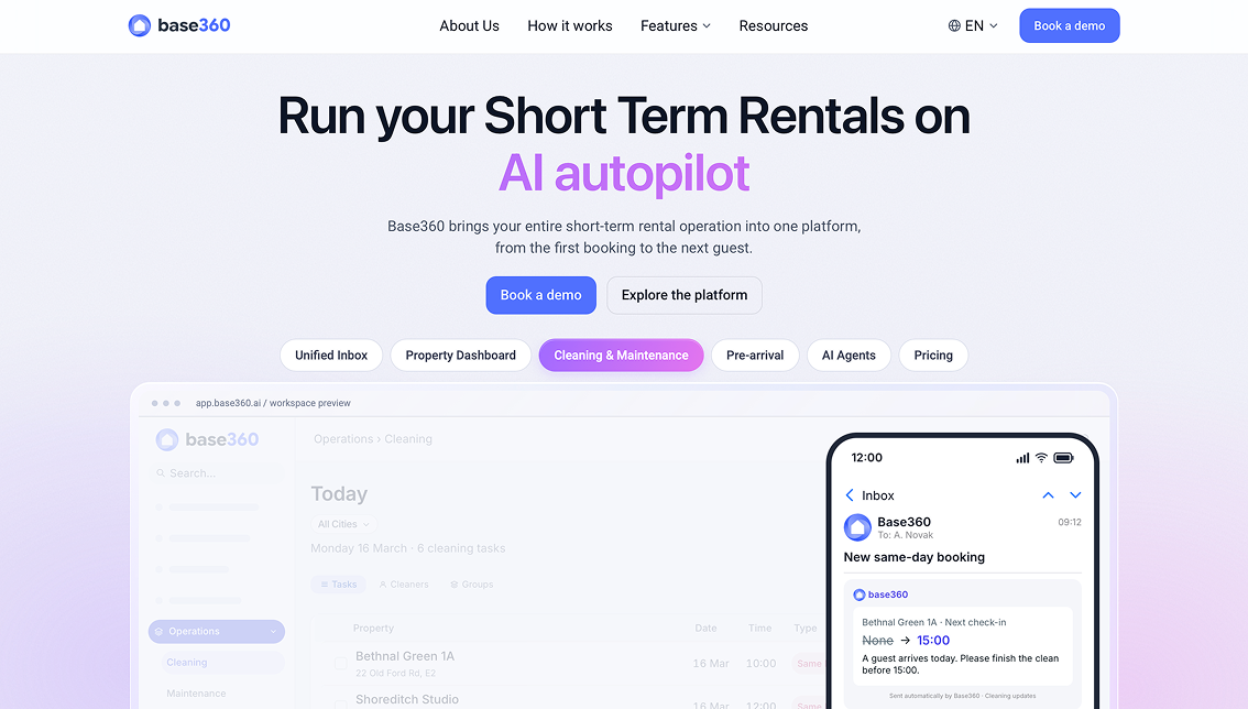
- I retained the off-white tone and dark green from Flex
- Transformed the purple from Base360 into a gradient
- Used the Base360 typeface, Roboto, along with the rounded corners already present in both brands.
- Since there were no pre-existing brand elements to build upon, I incorporated gradients and geometric shapes to give the page a distinct personality.
Color Palette
Assets made



High Fidelity Wireframes
Browse the final designs in Figma.Scroll and zoom to explore each screen.
Interactive prototype
Scroll through the page as a visitor would.